IEAnalyzeR Plotting Customization
IEAnalyzeR_Plotting.RmdIntroduction
This vignette demonstrates the choices available in the plotting
function of IEAnalyzeR, plot_fn_obj.
library(IEAnalyzeR)Here are the default figures plotted with the
plot_fn_obj function on a variety of data with no
customizations. They include a single indicator, a multi-indicator
representing four regions, a multi-indicator using monthly data, and an
indicator with two categories of indicators..
# Single Indicator
plot_fn_obj(single_data_formatted)
# Multi-Indicator
plot_fn_obj(multi_data_formatted)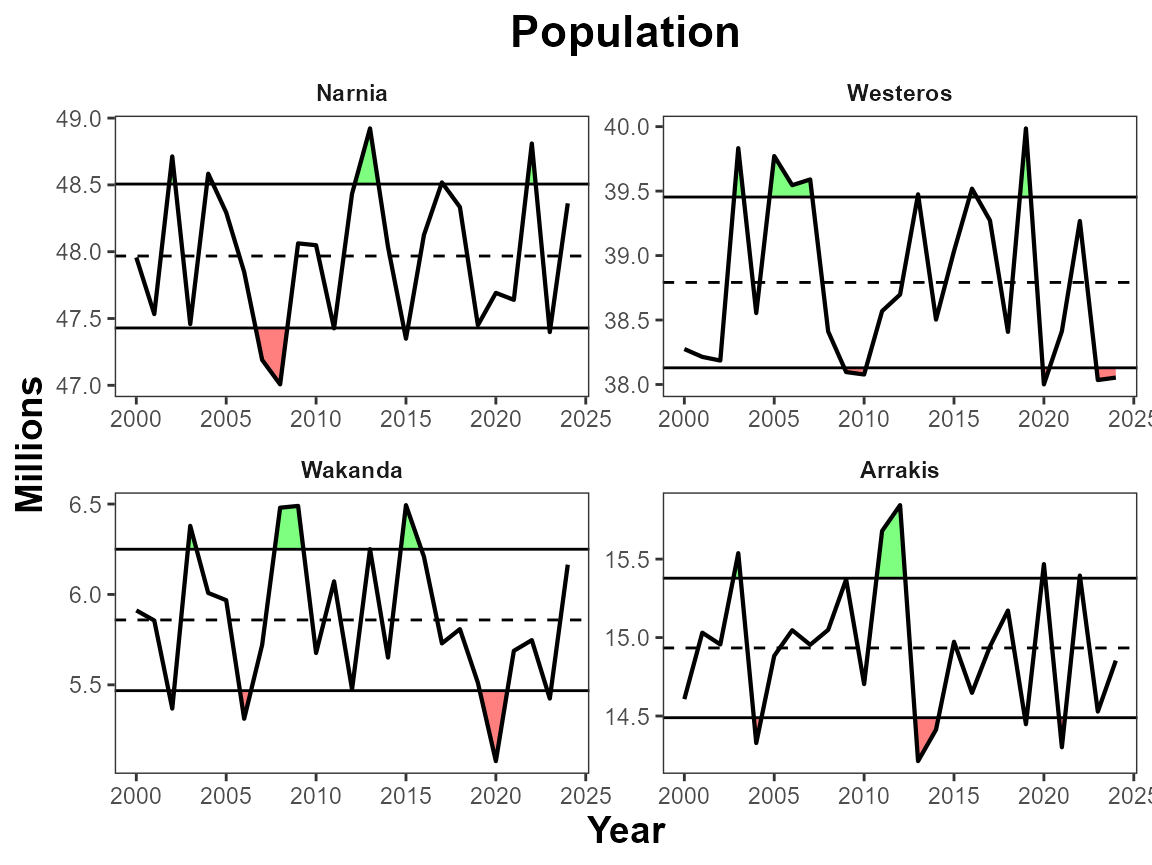
# Multi-Monthly Indicator
plot_fn_obj(monthly_data_formatted)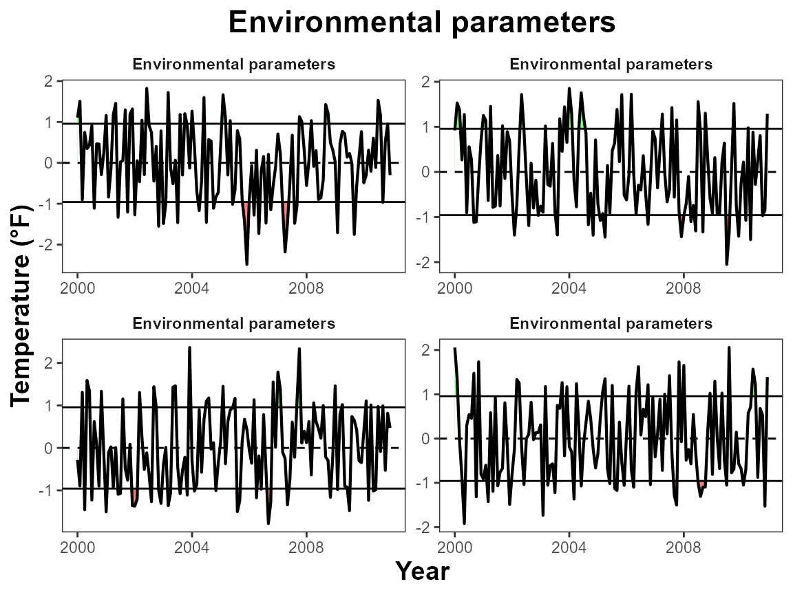
# Two category indicator
plot_fn_obj(twocat_data_formatted)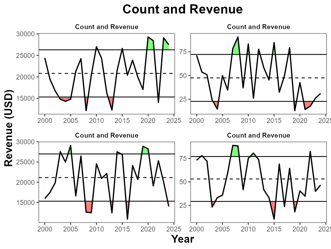
Labels
Manual ylab, xlab title
By default the x-axis displays as “Year”, the y-axis uses the “unit”
variable, and the title uses the “indicator” variable. You can use
manual_xlab, manual_ylab, and
manual_title to easily customize these features.
# Manual labels
plot_fn_obj(single_data_formatted,
            manual_title = "Red Drum",
            manual_xlab = "Time",
            manual_ylab = "Pounds (thousand)")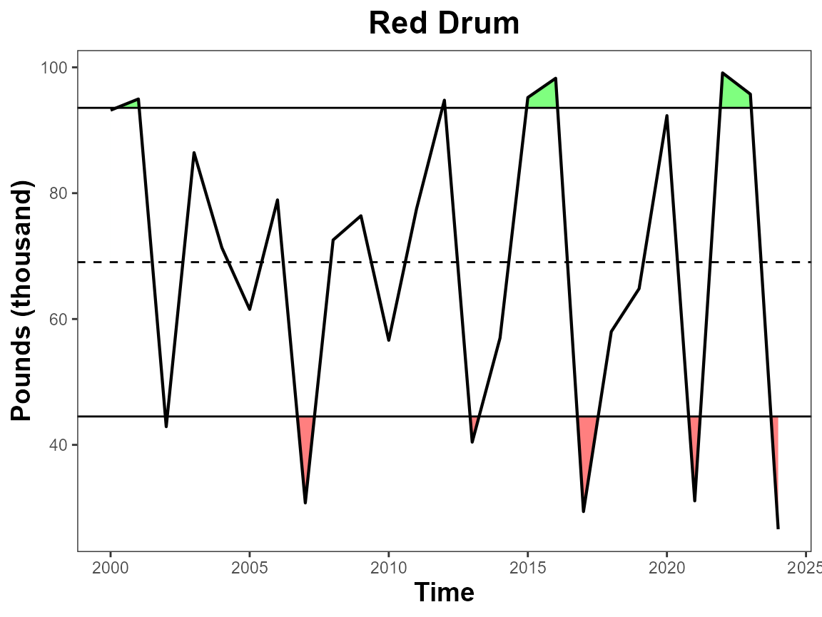
Separate Y Labels
This argument moves the facet title to the y-axis. It is intended for use with multi-indicators. This is a way for you to have different y-axis labels and units.
# Move sub-panel labels to the y-axis
plot_fn_obj(multi_data_formatted, sep_ylabs = T)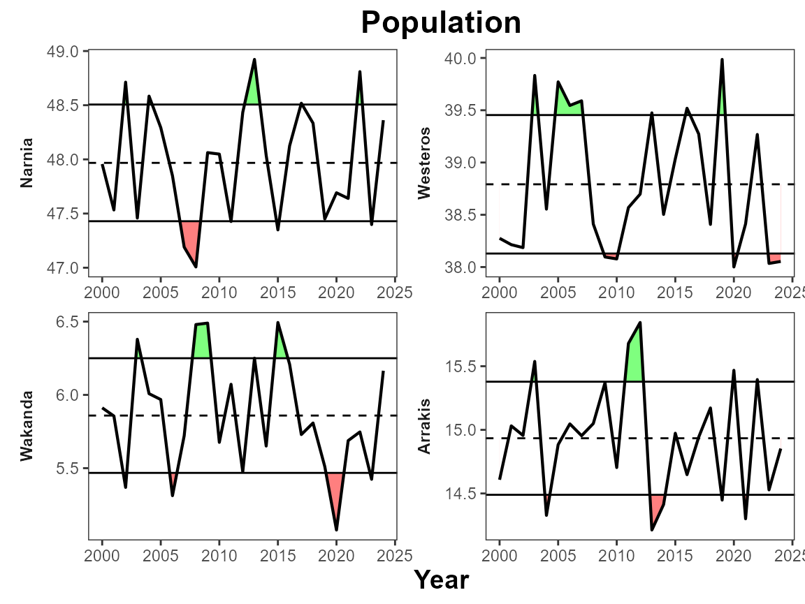
Y lab sublabel
This argument creates a sublabel for the y-axis using the “indicator”, “unit”, and “extent” variables. By default it uses “indicator” as the main label and “unit” as the sublabel. You can choose which variables are used.
# Default to Indicator & Unit
plot_fn_obj(single_data_formatted, ylab_sublabel = T)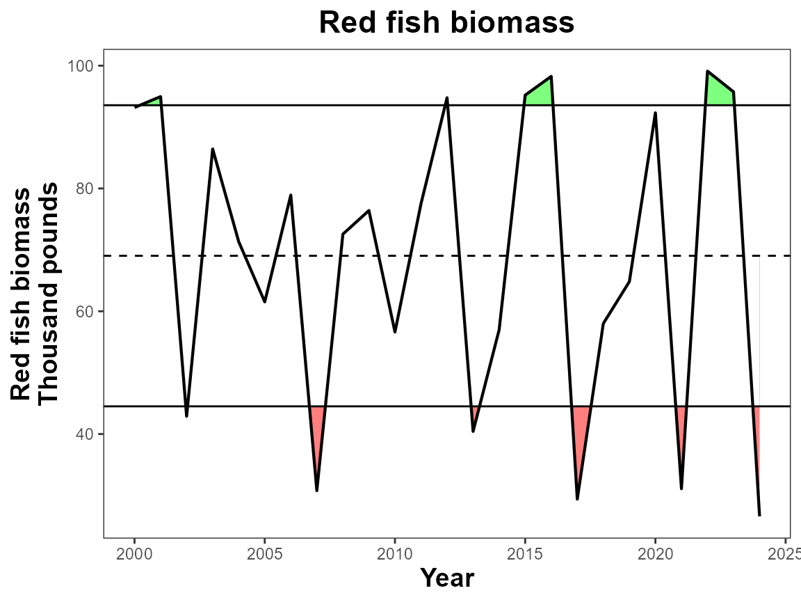
# Choose two variables to use as y-axis title and subtitle
plot_fn_obj(single_data_formatted, ylab_sublabel = c("indicator", "unit"),
            manual_title = NA)
#> Warning: `label` cannot be a <ggplot2::element_blank> object.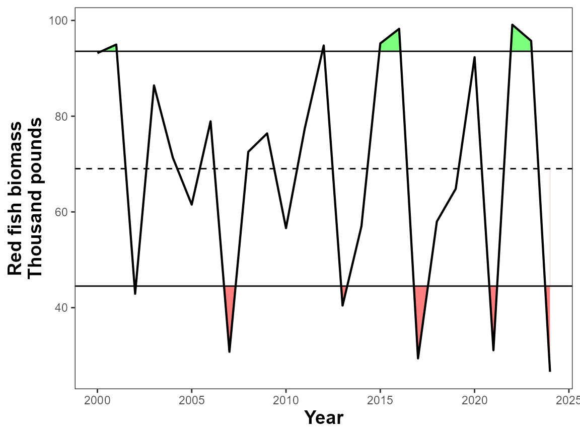
Multi plots
Facet Scales
The function uses facet_wrap to create multi-plots. The
facet_scales argument allows you to decide whether x and y
axis are shared among plots or remain the same. By default the scales
are “free”, you can choose which dimension to allow them to be free
“free_x” or “free_y”, or you can keep both the same with “fixed”.
# Fix axis scales for comparison
plot_fn_obj(multi_data_formatted, facet_scales = "fixed")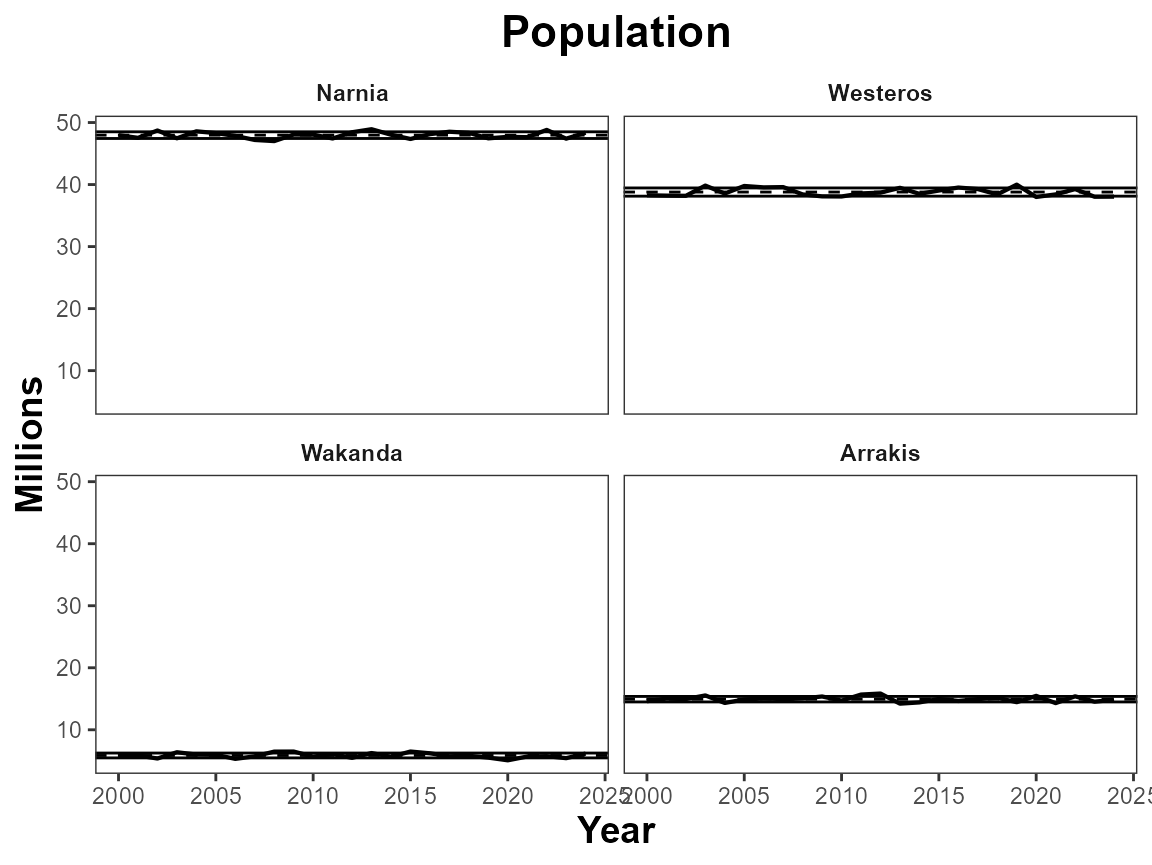
Ncol
Use ncol to determine the number of columns a multi-plot
figure should contain.
# Define number of columns
plot_fn_obj(multi_data_formatted, ncol=1,
            manual_title = NA,
            manual_ylab = "Population (millions)")
#> Warning: `label` cannot be a <ggplot2::element_blank> object.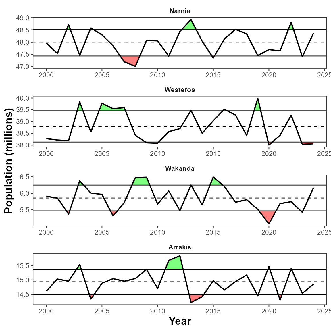
Facet grid
This feature is useful for when you have two categories of data in
your dataset. Here we look at count and revenue for two different
regions. Using facet_grid to group the variables by unit
and extent, allows us to align the subpanels correctly and use the unit
and the y-axis text.
plot_fn_obj(twocat_data_formatted, facet_grid = c("unit", "extent"),
            manual_ylab = NA)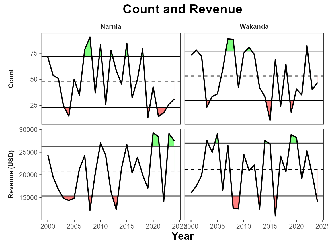
General customization
lwd
Use this to adjust the linewidth of the line.
# Change linewidth
plot_fn_obj(single_data_formatted, lwd = 2)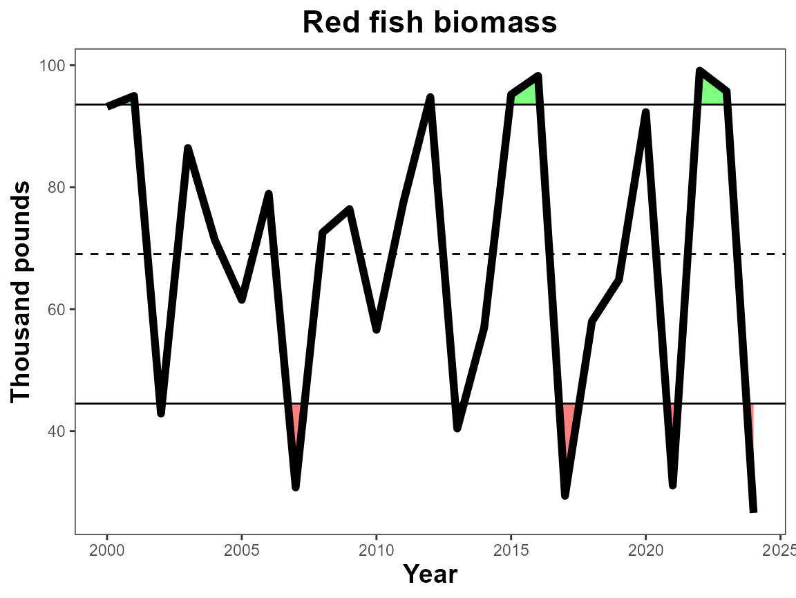
pts, pt_size
Add points to the figure and adjust their size with
pt_size
# Add points
plot_fn_obj(single_data_formatted, pts = T, pt_size = 2)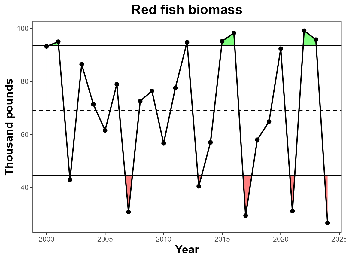
Xbreaks by
The breaks on the x-axis naturally change based on the number of data
points in the dataset, however if you would like define the number of
years between x-axis ticks you can use xbreaks_by.
# Define xbreaks
plot_fn_obj(single_data_formatted, xbreaks_by = 3)
Figure width
Figure width defines how wide the figure is in inches. Overall dimensions can be saved when saving the figure, however when using the trend feature, it is important to set the fig.width to the intended saved dimensions so that the trend symbols appear in the correct place.
# Define figure width
plot_fn_obj(single_data_formatted, fig.width = 5.5)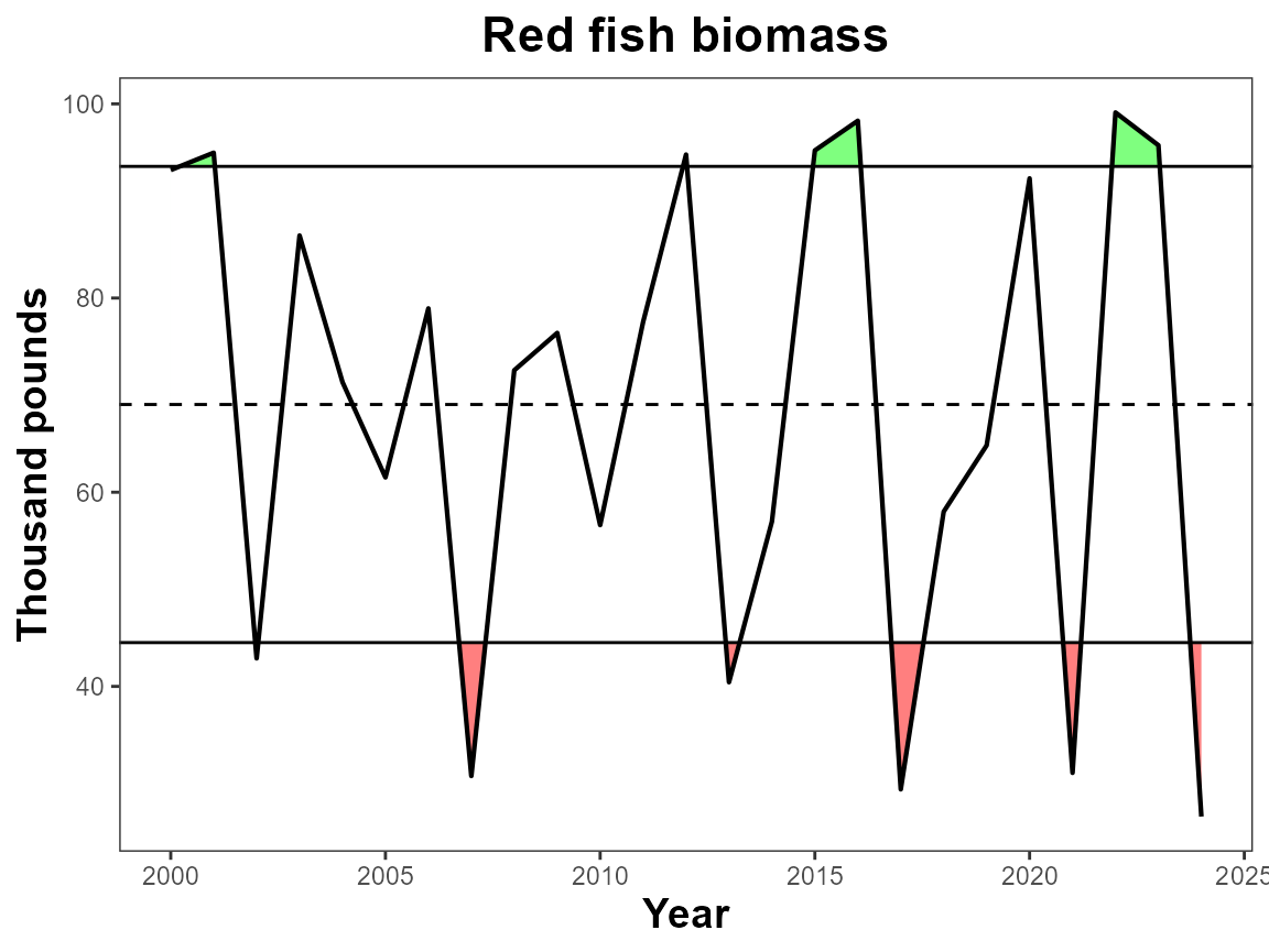
Features
Interactive
This argument applies the ggplotly() wrapper around the produced plot which adds interactivity to the figure. Useful for web applications. Warning some arguments may not work correctly with this feature.
# Make interactive
plot_fn_obj(single_data_formatted, interactive = T)
Trend
Add trend symbols to the plot. The trend is of the last 5 years of
the data. This will shade the selected data. See fig.width
for making sure the trend symbols are in the right spot for final
figures.
# Add trends & define figure width
plot_fn_obj(single_data_formatted, trend = T, fig.width = 6)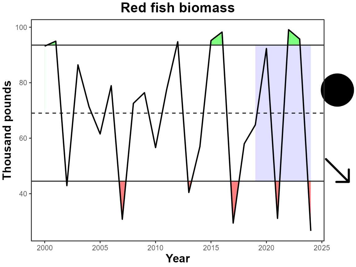
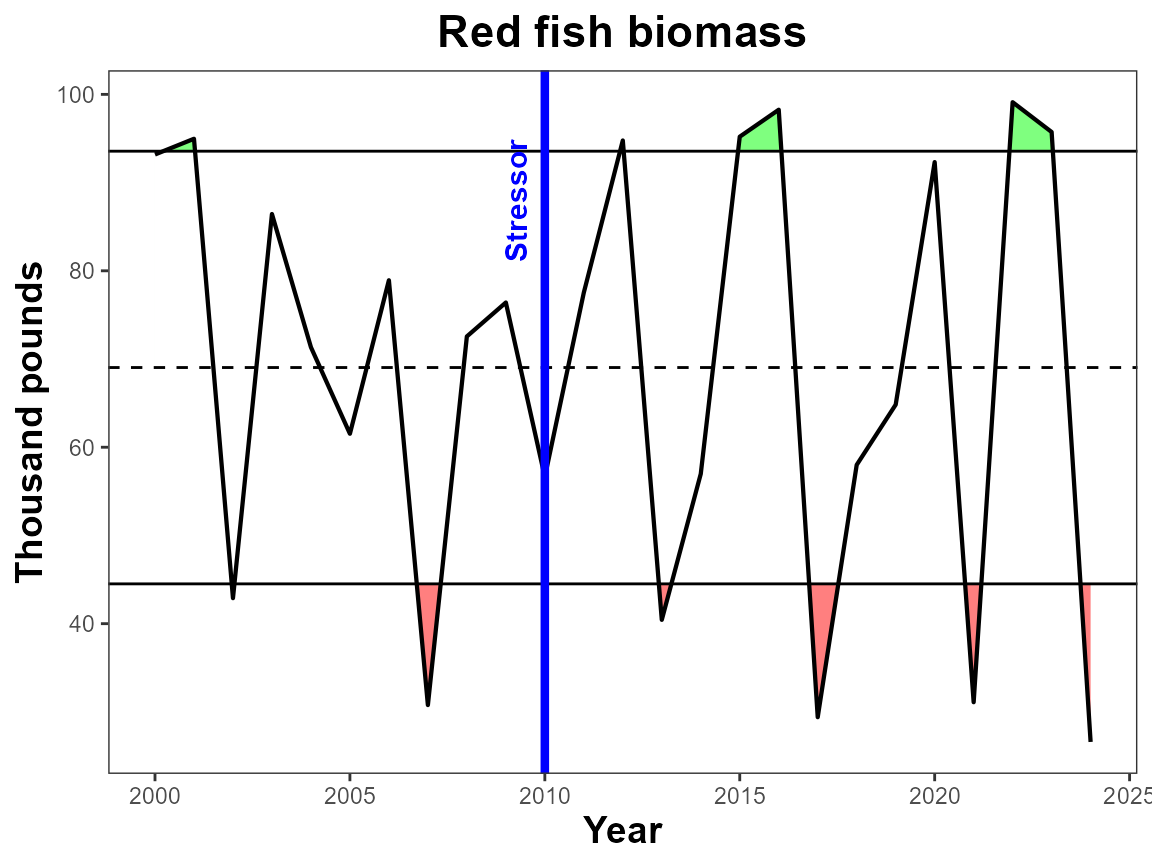
Further Customization
The plot_fn_obj function creates a ggplot object,
therefore if you are familiar with the plotting mechanics of ggplot, you
can add layers as you would any other plot.
# Load ggplot2
library(ggplot2)

# Create plot with IEAnalyzeR
IEAnalyzeR_plot<-plot_fn_obj(single_data_formatted)

# Add layers using ggplot2
IEAnalyzeR_plot+
  geom_vline(aes(xintercept=2010), color="blue", lwd=1.5)+
  annotate("text", label="Stressor",
           x=2009.25, y=88,
           angle=90, size=4,
           color="blue", fontface="bold")